A Quick Guide to UI Design Fundamentals
UI is an art and a science! This guide will introduce you to the basics of UI design to help you better understand—and design today's user interfaces.
User Interface (UI) design is more than just colors. Whether it's your first time designing the front-end of an app or you're looking to change jobs or update your skillset, this article has the UI fundamentals you need to know.
User interfaces are the bridges between users and products. UIs touch almost every aspect of our lives. They shape how easy it is to use a product, determine its value, and impact whether we overlook it or buy it! If you want to design great products, first, let's learn how UIs work.
What is UI design?
As defined by the Interaction Design Foundation: "UI design is the process designers use to build interfaces in software or computerized devices, focusing on looks or style." In other words, UI design focuses on creating an interface that's easy to use and delightful. But that's not all; UI design has to bring accessibility and consistency in the visual language across the entire product. A good UI design makes the experience feel natural through spacing, color, patterns, and other key elements.
Probably now you think that UI design sounds very similar to user experience (UX) design. And the truth is, they both work hand in hand. Let's check out more differences between what a UI and UX designer do so you can get the whole picture.
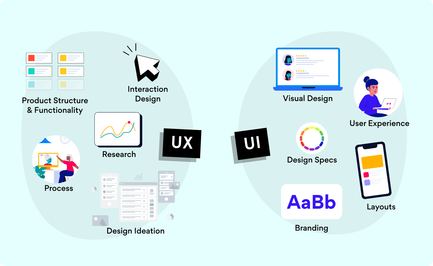
What's the difference between UX design and UI design?
UX design:
- It's the "look and feel." It's the interaction design.
- It covers the entire process, from branding to design to functionality.
- Focus on product structure and strategy.
- Works on the research analysis as insights and customer journey.
- Design ideation: Prototypes and wireframes.
UI design:
- It's more about the "look." It's the visual design.
- UI design is part of the user experience.
- Focus on branding and graphic development.
- Defines visual design documentation: Layout and responsiveness.
- Design specs: Icon and illustration set.
In the end, UI and UX design have the same purpose: To improve the accessibility and effectiveness of a digital product. The UI and UX design teams are usually formed by developers, graphic designers, and information architects.
If you're starting to get the hang of this, and you'd like to learn more about creating a better user experience focused on web accessibility, check out this previous blog post with key tips. But if you still want to discover the fundamentals of UI design, follow us! Or rather, keep reading.
5 UI design principles to remember
Since the internet is a crazy wide world, you will find many different definitions and lists of UI design principles by various authors. But we will focus on the common ones.
By saying principles, we mean fundamental points you need to consider for your UI design. So if you apply these criteria to your work, you will achieve better user interfaces. Consider these as the advice you need to follow for your next project:
1. Visibility
Remember, our mission is to get the users to where they need to be. The key elements need to be visible. Try not to fall into thinking that everything is important. If you do not avoid that common mistake, you'll end with a cluttered interface that will drive off users. And we don't want that!
If you have a clear and understandable interface, people will quickly learn to use your product or website. This way, you will be leaving them to explore your easy-to-navigate interface and enjoy the journey.
2. Consistency
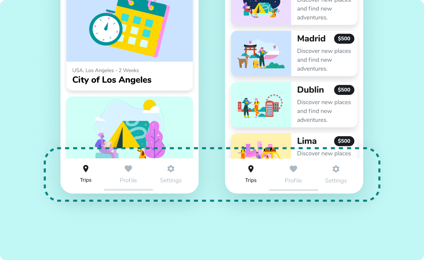
Whether it's the color, typography, buttons, or locations, keep it the same. Consistency is essential for letting the users understand how everything works and where to find specific elements. Consistency is about trust. It's about allowing the user to control the experience.
Have you ever used an app with a design that makes you feel like every screen is different? You end up feeling lost! For example, when the menu changes its position in each section. Well, that's the result of an inconsistent UI design.
Think of consistency as to how the same action drives the same result. The same button, in the same position. The same color for the same notification and so on.
3. Feedback
"Oops! That file is too big. Let's try again."
Feedback means letting the user know if they pressed the right button or not. You can play with the visual elements for this design principle, just like when you see a checkmark on the screen when you finish setting your profile correctly. Giving the users feedback is vital to help them go in the right direction and keep using your product.

4. Predictability
As soon as you see a bold blue button, do you know how to use it? Is it a call to action to the next step?
Predictability means designing the interface so that the user knows the forecast of the following action. That's the magic of UI design: letting users figure out what to do and where to click—or tap next to achieve their goals.
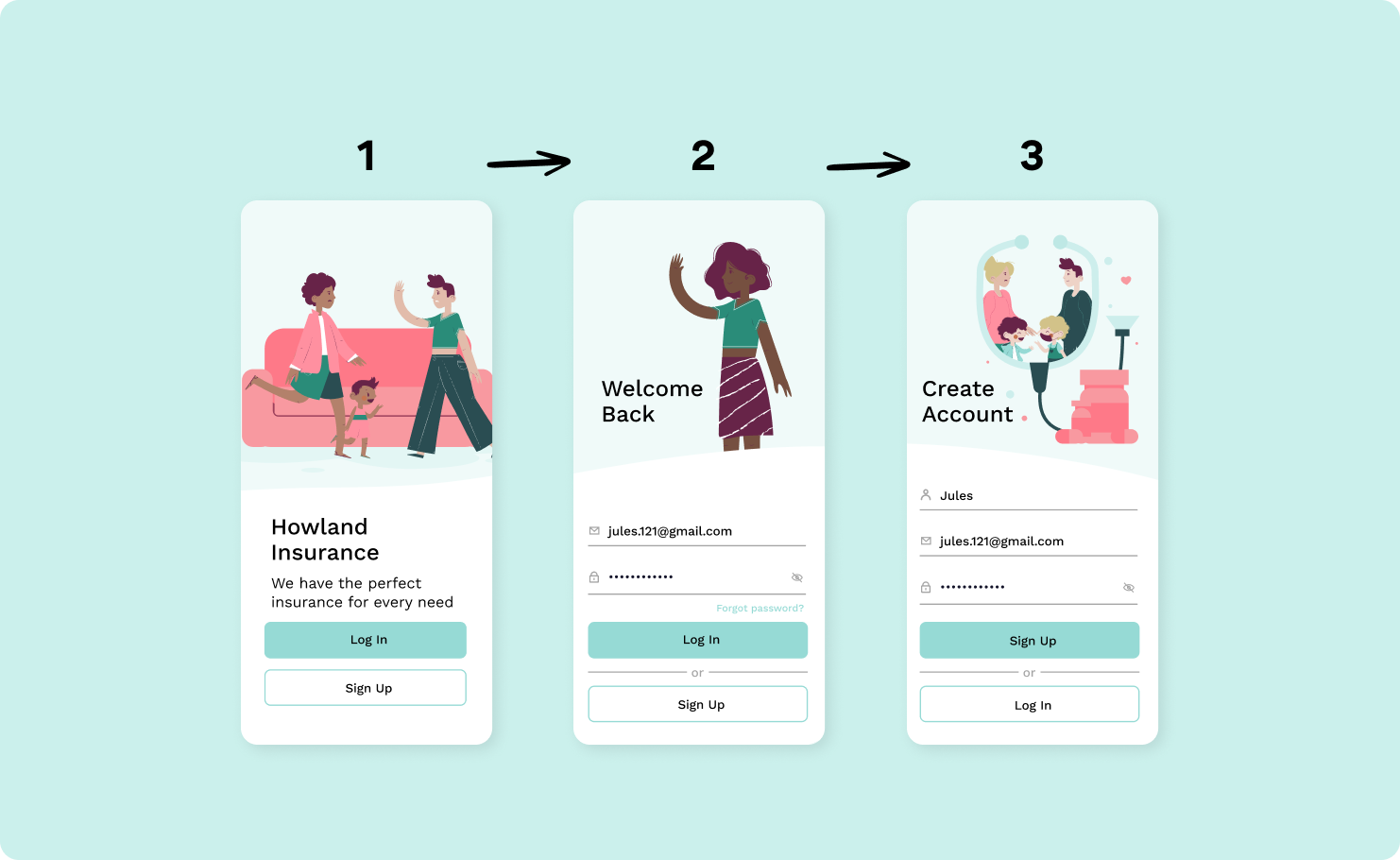
5. Learnability
The combination of the four previous UI design principles leads to this one. Learnability is how you create an accessible interface that the user understands.
Your goal is to facilitate how people use your product. With this principle in mind, you can create an interface that allows the users to move around and get to their desired actions without needing assistance in any way. An intuitive interface it's a successful UI design.
Make it easy for everyone to interact with your product. Remember that UI design should provide visual cues to reduce the number of tasks that need to be done. Don't forget to consider your target audience and their needs. Also, keep in mind the type of interface you will create. When working with apps, you have a smaller screen, so you'll want to delete all the elements that are not helping your users.
4 Must-know design tools for your creative projects
To create user-friendly interfaces, you need to work with user-friendly design tools. Please don't overwhelm yourself trying to learn how to use them all. You can always try different tools to find the one you feel more comfortable with. We're sure soon you'll learn how to master more than two!
These are some of the best design tools you can consider for your next creative project:
1. Sketch
Sketch is one of the leading tools for UX/UI designers, plus it relies a lot on integrations. It's very easy to learn, so you can get the basics in a few hours of using it.
2. Figma
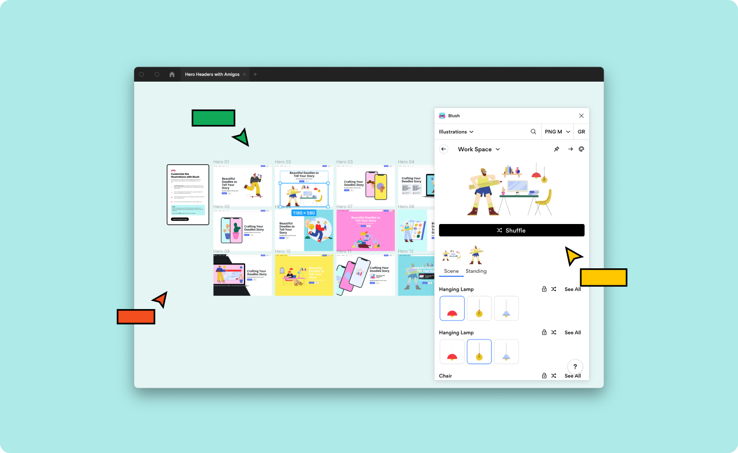
Figma is almost the same as Sketch. It's perfect for collaborative projects to work with your team and see the changes in real-time. Plus, when you're working on Figma, you can use the Blush plugin and work directly on your designs without losing context.
3. InVision
InVision is one of the favorite tools for designers to create interactive mockups. Since InVision is always getting feedback from its users, it is consistently improving.
4. AdobeXD
AdobeXD is perfectly equipped for designers, and it has almost the same features as InVision. AdobeXD helps you save time with features like repeat grids, and since it is part of the Adobe ecosystem, it's a robust software that'll help you with the right tools for your UI design.
There are many design tools that you can try. But any of these will help you get your UI design done in a breeze. And just like any other software, they constantly update their features so you can get a better experience.
Where to find inspiration and discover what other creatives are doing
When in need of a creative spark, check out these four sites for inspiration. You can see examples, prototypes, real work from other people, and ideas from all around the world.
1. Behance
It's the world's largest creative network for showcasing and discovering creative work.
2. Dribble
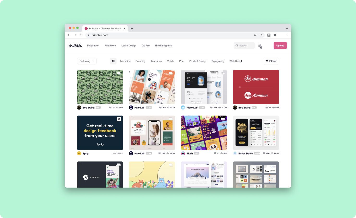
Dribble is where designers go for inspiration, feedback, community, and even jobs. It's a great resource to find and connect with designers worldwide.
3. Awwwards
It recognizes and promotes the talent and effort of the world's best developers, designers, and web agencies.
4. Screenlane
Check out this site to keep up with the latest web & mobile app UI design trends.
Create simple, beautiful, and smart UI designs!
This quick guide is for you to get the basics around UI design, but there's much more to learn and techniques you can use for a slick interface. So if you want to keep reading more about this topic, check out this article: An Introduction to Color Theory.
And we could keep going and going, talking about UI design, but it's time for some action! It's your turn to create your own mockups. Keep the interface simple, stay consistent and empower your users. Remember, practice makes perfect!
We're always sharing tips and tricks for you to use in your next creative projects, so don't forget to follow us at @Blushdesignapp to stay tuned!
